The History of Car Logos: What Do These Symbols Really Mean?
The automotive logo is more than just a decorative element on the hood. It encapsulates the brand's history, its ambitions, technological achievements, and the cultural context of the era. We are used to seeing these symbols daily, but we rarely consider the meanings behind them and which of the popular explanations are supported by facts, and which are beautiful legends.
In this material, we analyze statements from the video and check their factual accuracy.
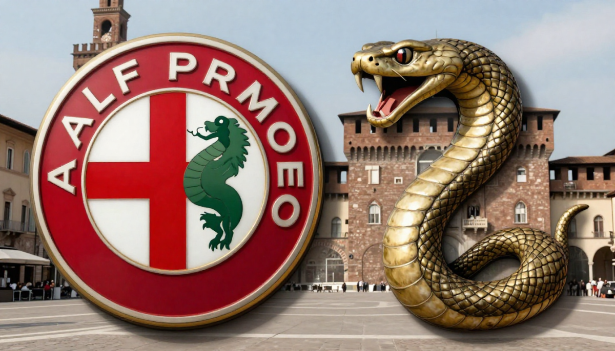
Alfa Romeo: the cross of Milan and the Visconti snake
It features a red cross on a white background on the left and a snake holding a person in its mouth on the right. The story goes that he invented the Alfa logo while waiting for a tram at the Piazza Castello station in Milan.
The emblem is indeed based on two historical symbols of Milan - the red cross on a white background, associated with the city coat of arms, and the so-called biscione - the snake of the Visconti family, who ruled Milan in the Middle Ages.
The company was founded in 1910 as A.L.F.A. - Anonima Lombarda Fabbrica Automobili. According to the company's historical sources, the sketch of the emblem was developed by Romano Cattaneo, one of the employees, inspired by the symbolism of Milan. The mention of the Piazza Castello station is present in the corporate legend; however, there is no documented evidence of such an episode. This is rather an established element of the brand narrative.
Some claim that the snake eats the person. Others say that the beast does not eat but spits out the person, which symbolizes rebirth and purification.
Heraldry historians point out that the image relates to medieval symbols of power and victory. In earlier interpretations, one can indeed find the interpretation of "devouring the enemy." The version of "rebirth" appeared much later and is closer to the modern marketing reinterpretation of the symbol.
Thus, the basic elements of the logo correspond to historical facts, but interpretations of its deeper meaning vary - from a literal symbol of victory to a softer interpretation of renewal.
Audi: four rings and the crisis of the 1930s
This story begins in 1932. It was then that four automotive companies of the time merged to form Auto Union.
This statement corresponds to historical reality. In 1932, the companies Audi, DKW, Horch, and Wanderer formed the Auto Union AG consortium during the Great Depression. The economic crisis indeed became one of the key factors for consolidation.
The four interlinked rings symbolized the four independent brands that were part of the union. Each continued to produce cars under its own name. After World War II, the structure of the consortium changed; however, the symbol of the four rings was preserved and later became exclusively associated with the Audi brand.
The connection to the Olympic Games has no historical basis. The similarity of the visual composition to Olympic symbolism is a coincidence, as the Auto Union logo appeared before the formation of modern Olympic branding in its current form.

BMW: propeller or the flag of Bavaria?
The first and more well-known version states that the logo symbolizes a rotating airplane propeller.
This version is widely spread; however, historically it is secondary. Bayerische Motoren Werke indeed started as a manufacturer of aircraft engines. In 1929, BMW's advertisement featured an image of the logo against the backdrop of a rotating propeller, which solidified the corresponding association.
The story of the propeller demonstrates how easily a visual association turns into a persistent narrative. A single striking advertising campaign is enough for a secondary explanation to be perceived as the primary source.
Such myths are not necessarily false—they simply emerge later than the actual event. Over time, they begin to be perceived as the "real story," as they turn out to be simpler, more visual, and emotionally more convincing than the archival details.
However, research into corporate archives shows that the original logo design from 1917 was created based on the round shape of the previous company Rapp Motorenwerke and used the colors of Bavaria—white and blue. The order of the colors was inverted due to existing restrictions on the use of state symbols.
When the BMW logo was created, German trademark law prohibited the use of coats of arms or other national symbols in them.
Indeed, there were legal restrictions on the direct use of state emblems. Therefore, the logo did not formally copy the flag of Bavaria but used a similar color scheme in a modified sequence.
Thus, it is historically more accurate to consider that the logo reflects regional identity, while the "propeller" is a later interpretation that arose thanks to marketing materials from the late 1920s.

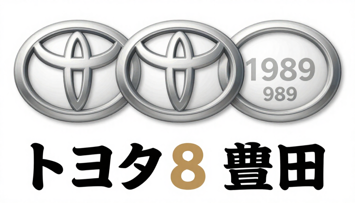
Toyota: eight strokes and three ovals
The word "Toyota" in Japanese is written with 10 strokes, while "Toyoda" is written with only eight.
The company was indeed founded by the Toyoda family. In 1936, it was decided to change the spelling of the name to "Toyota." In Japanese writing, the variant トヨタ consists of eight strokes, whereas 豊田 requires a greater number. The number eight in Japanese culture is associated with prosperity and expansion. This fact is confirmed by the corporate history of the company.
The ovals we know today appeared only in 1989. The company has never officially disclosed their meaning.
The three-oval emblem was indeed introduced in 1989. However, the statement about the complete absence of an official interpretation is not entirely accurate. Corporate materials from Toyota indicate that the two intersecting ovals symbolize the trusting relationship between the customer and the company, while the outer oval represents the global expansion of the brand.
Popular interpretations of the steering wheel or globe are secondary visual associations. The basic idea of the connection between the brand and the customer is officially established.
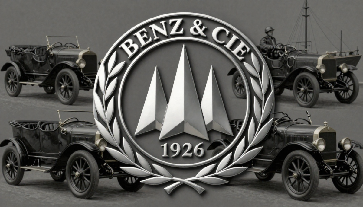
Mercedes-Benz: three-pointed star
In 1926, the merger of the Benz and Daimler companies took place, forming Daimler-Benz AG.
The merger of Benz & Cie. and Daimler-Motoren-Gesellschaft indeed occurred in 1926, forming Daimler-Benz AG. The three-pointed star as a symbol was registered even before the merger - in 1909 by Daimler.
The star symbolizes the company's dominance on land, at sea, and in the sky.
This interpretation is confirmed by corporate history. The three rays represented the ambition to use Daimler engines in land, sea, and air transport. After the merger with Benz, the emblem was surrounded by a laurel wreath - a reference to the former Benz logo.
Over time, the wreath was simplified to a concise circle, reflecting the overall trend towards minimalism in industrial design of the 20th century. The color interpretations - silver as technology and black as elegance - relate more to modern marketing language than to historical documents from the early century.
What is the conclusion: truth, myth, or unproven?
The automotive industry constantly updates technologies, platforms, and model designs; however, logos remain surprisingly stable. The reason lies in the strategic function of the symbol: it accumulates reputation, trust, and accumulated brand equity.
A sharp change in the emblem carries the risk of breaking with history. For automakers, history is part of the product's value. This is why the evolution of logos often follows the path of careful modernization rather than radical revision. The shape is preserved, lines are simplified, colors are adapted - but the semantic foundation remains the same.
If we compare the statements from the video with historical data, the picture looks as follows:
- Alfa Romeo - the historical basis of the logo is confirmed; details of the sketch's origin relate to corporate legend; interpretations of the snake vary.
- Audi - the story of the four rings is fully confirmed; the connection to the Olympics is a myth.
- BMW - originally a regional symbol; the version with the propeller appeared later and became popular due to advertising.
- Toyota - the name change and the symbolism of the number eight are confirmed; the interpretation of "complete lack of explanations" is incorrect.
- Mercedes-Benz - the three-pointed star is indeed related to the idea of engine universality; the design evolved gradually without radical changes.
In all cases, it is evident how, over time, historical fact intertwines with marketing narrative. The logo becomes not just a sign, but a story that the brand tells about itself. And this story often turns out to be a bit more complex and interesting than the brief popular version.
Sources
- The Story of Alfa Romeo - Alfa Romeo S.p.A., corporate materials
- Auto Union AG Historical Archives - Audi AG
- BMW: The History - BMW Group Classic
- Toyota Motor Corporation 75 Years of Toyota - Toyota Motor Corporation, 2012
- Mercedes-Benz Brand History - Mercedes-Benz Group AG
- The Complete History of BMW - Auto Motor und Sport
- The History of the Automobile - Encyclopaedia Britannica

You might like

Festivals We Misunderstand
Festivals are often described as a universal language of joy. Tourist websites promise emotions, guides - scale, bloggers - unforgettable experiences. But behind ...

15 of the Strangest New Year's Traditions from Around the World
New Year is considered a universal holiday. It seems to erase borders: in different countries, people summarize the year, make plans, and set wishes. ...

The strangest Guinness records: how the absurdity industry is organized
When we hear about the Guinness World Records, our imagination often conjures up a set of absurd achievements: people eating airplanes covered in a million bees...